The WordCamp Lancaster 2020 logo began at the end of the 2019 summer, was launched in a tweet on December 5th, and is based on the Flower of Life, a sacred geometry symbol that was drawn by humans as early as the 7th century BC.
To be clear, I’m not a designer by trade. I’m a coder. Graphics projects wreck me emotionally, and I can’t find a way to charge for them and maintain my health. I choose a couple passion projects each year, and WordCamp Lancaster has been my muse for these two years that I’ve been the lead volunteer.
Lately, I’ve pushed myself to design in monochrome and only consider one or two colors after the shapes are complete. You can see this trend in the pieces I’ve shared at coreysalzano.com, and I believe the two WordCamp logos I’ve made have benefited from this discipline.
The wordmark came first. I find it valuable to decide on a typeface for the words or at least the most important words early on during a design.
Last year, Dustin Leer gave me great feedback while I was working on the 2019 logo. He suggested that I limit the number of typefaces in a logo to two. In a draft, I used a third for the digits of the year. It’s clear Dustin was right, I changed “2019” to use the same typeface as the word “Lancaster,” and I believe that’s what pushed 2019’s logo from good to great.
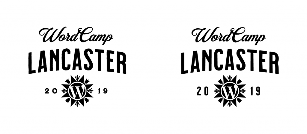
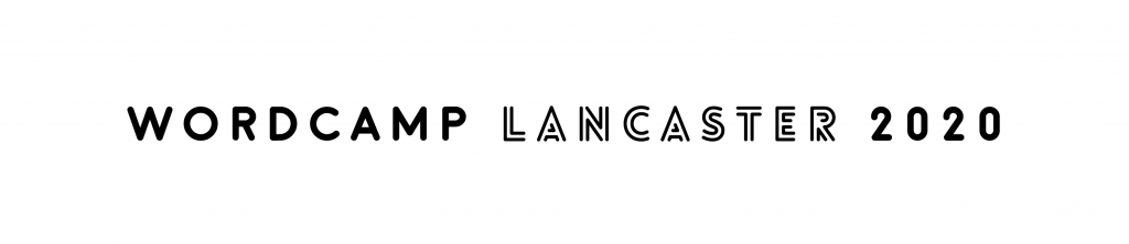
This year, “WordCamp” and “2020” both use a typeface called Moon that reminds me of the engraved wood signs used in Pennsylvania state parks.
The typeface used for the word Lancaster is Lovelo Inline. Lovelo Inline has uncontained inlines and rounded terminals that complement Moon and reveal pairs of lines. Each time slot at our event offers two presentations from which attendees can choose, and much of our local landscape is carved into parallel rows of crops.
I intended to create a round hex art logo containing the WordPress “W” logo from the beginning because I am a huge fan of annual traditions, and it’s worked so well for our event. My decision to use the Flower of Life didn’t come until Saturday, November 9th while listening to Eric Claypoole speak at the Lititz Library about the history of hex sign art. Claypoole is still painting barns after his father, Johnny, and there is more history on our Art page.
Here’s what my November looked like.
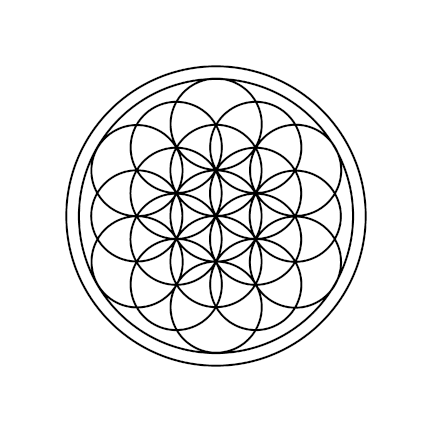
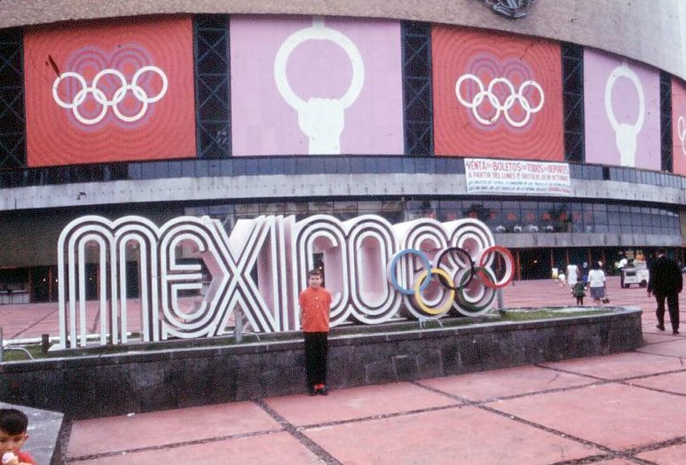
The move that made this logo was excluding lines belonging to circles on the perimeter that did not completely fit inside a surrounding circle. Only after this was it clear to me that this design was also going to be my nod to the most captivating logo that features overlapping circles, Lance Wyman’s Olympic Games Mexico 68.
The light blue on dark blue color combination was chosen by my teammates. I wanted to use a pink or a creamy off-white on blue. Dustin suggested we use the 2020 Pantone color of the year, Classic Blue, and away we went. The logo was public less than 24 hours later.
Thank you, Eileen, for your kind words and encouragement to share this.
Thank you, Dids, for sharing these striking photos of your paintings: 1, 2. They’re the best part of these compositions I made to share the event’s announcements.